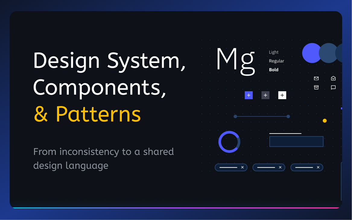
Step 1 -- Audit and Empathise
4 designers. 15+ modules. No shared library.
This project didn't follow a traditional UX research process -- it was a systems problem that needed a systems response. Four designers were working in parallel on different modules with no shared components, no naming conventions, and no agreed-upon patterns. Stakeholders kept flagging inconsistencies in demos. New features took longer to ship because every team reinvented the same UI solutions.
The first step was a full product audit -- not of user behaviour, but of design decisions. Every screen across all 15 modules was reviewed against four questions:
- Visual consistency: Do fonts, sizes, buttons, and labels look the same across modules?
- Functional consistency: Do the same interactions behave the same way everywhere?
- Internal consistency: When we introduce new pages, do users already know how to use them?
- External consistency: Are we aligned with the mental models users bring from other enterprise tools?
15+
Modules audited across web and mobile
4
Designers working in parallel without shared standards
30+
UI patterns documented and standardised
2
Platforms - Web and Mobile aligned under one system
The audit finding: The most common inconsistency was not visual -- it was behavioural. The same action (e.g. editing a table cell, approving a request, assigning an employee) was implemented in 3-4 different ways depending on which designer built that module first. Users were learning the same task multiple times.
Step 3 -- Build
Atomic Design as the framework. Figma as the source of truth.
We adopted Atomic Design (Atoms → Molecules → Organisms → Templates → Pages) as the structural framework for the component library. Every UI element was categorised into this hierarchy, then built in Figma with variants, nested components, and shared tokens.
⚪
Atoms
Buttons, chips, badges, icons, inputs, date pickers
🧩
Molecules
Employee cards, filter tags, form rows, table cells
🏛
Organisms
AG Grid table, slideovers, modals, navigation sidebar
📐
Templates
Policy creation layout, list-detail layout, dashboard layout
📱
Pages
Attendance, Leave, Payroll, Field -- all module pages
The categorisation mistake we corrected: In the initial attempt, we put Employee Card into Atoms. It's actually a Molecule -- it combines an Avatar atom, a Name Text atom, a Label atom, and an Action Button atom. Getting the hierarchy right was essential to make nested component overrides work correctly in Figma.
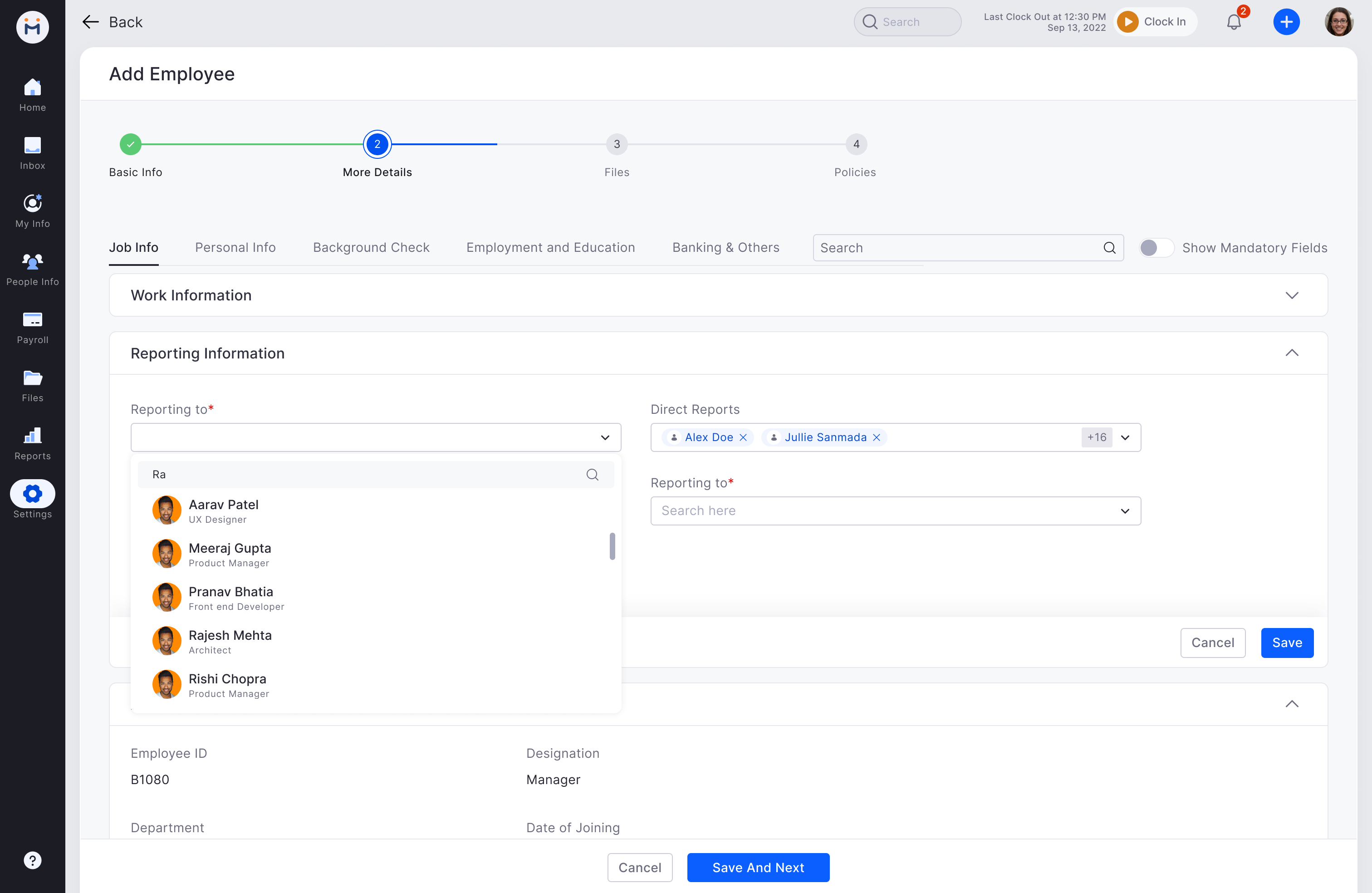
Pattern 01 -- Navigation
5-Level Navigation Hierarchy
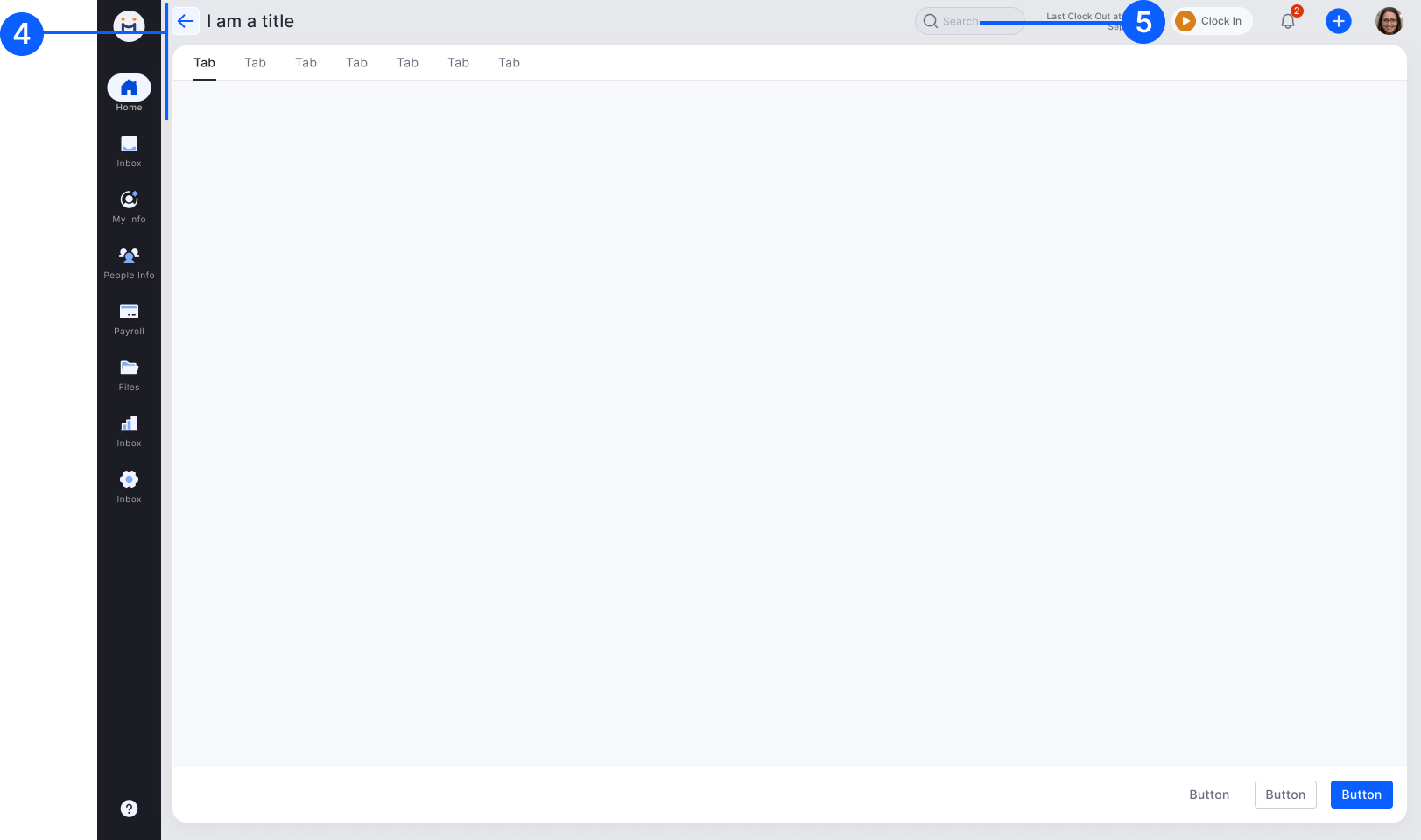
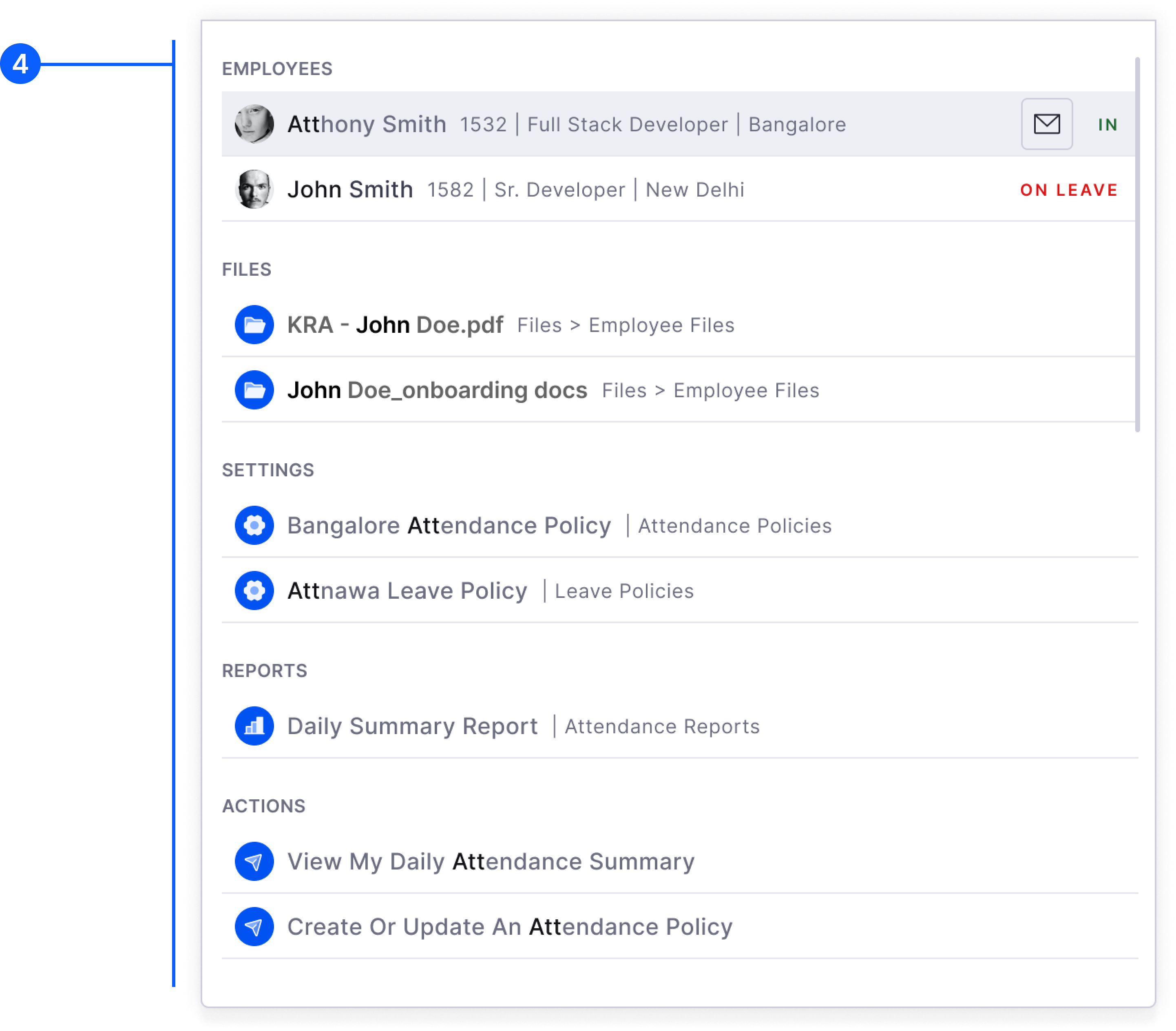
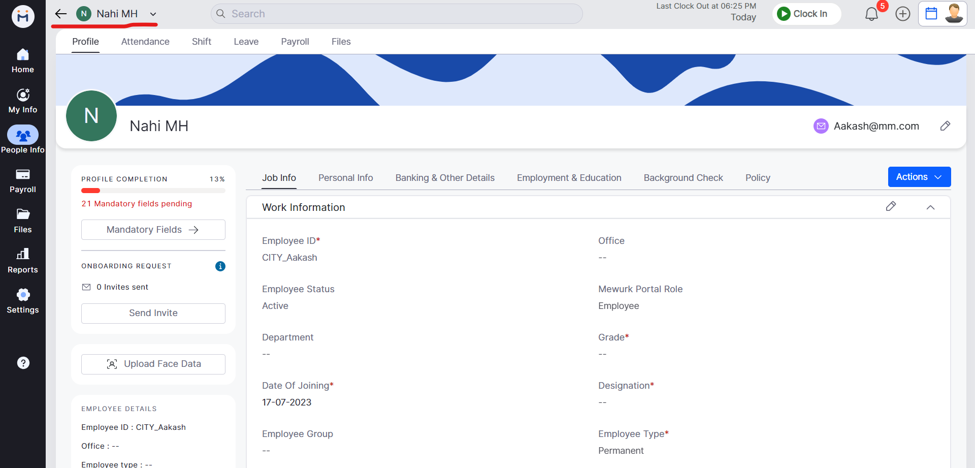
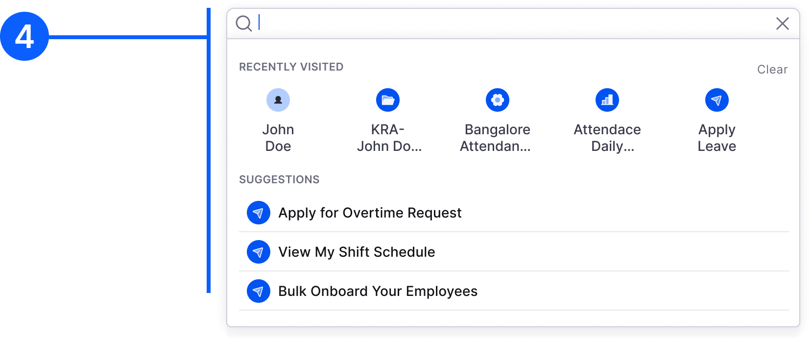
Navigation was the first pattern standardised because it affects every module. We defined 5 levels: (1) Left Bar primary menu -- persistent throughout, (2) Left Sub-menu -- collapses for more space, (3) Horizontal tabs -- third level for sub-sections, (4) Individual pages with Back function -- for creation and detail flows, (5) Top Header with Global Search -- persistent, with notification, clock-in/out, and profile. This hierarchy is now followed across all 15+ modules consistently.
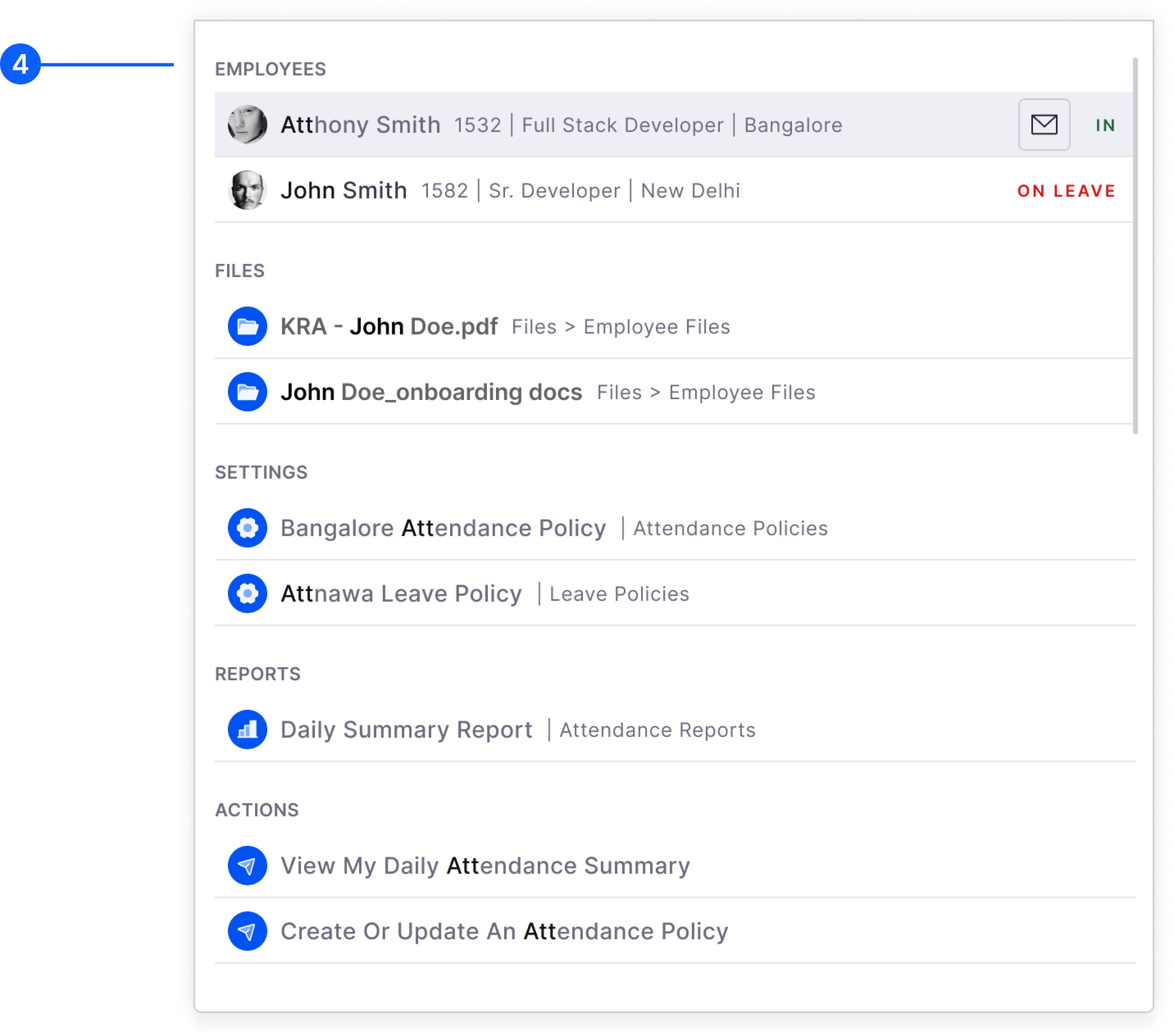
Pattern 02 -- Global Search

Web
Primary Search Screen
Search is categorised by content type -- employees, modules, documents. Relevant results shown upfront before typing to aid navigation discovery.
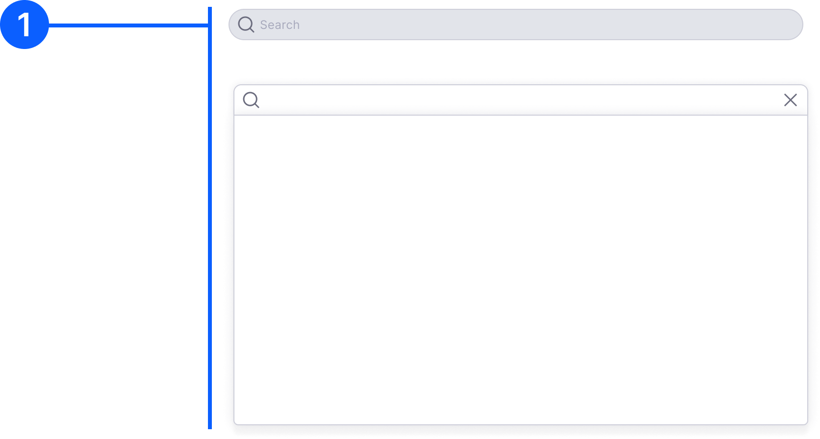
Web
Search Results with Context
Results are contextualised by user role and past activity. Personalised to surface most relevant content for that user's workflow.
Pattern 03 -- Table and AG Grid
AG Grid Table -- the workhorse of the product
AG Grid is used for data-heavy views across all modules. Key rules: max 7 columns, lazy loading, alternating row background (#F7F8F9 on white). Edit controls are upfront for always-editable columns, and on-hover for selectively editable tables. On hover: blue outline + action-specific icon (pencil for text, clock for time, calendar for date, arrow for dropdown). Role-based hidden cells (***) for data the user lacks permission to view.
Web
Inline Edit and Approve/Reject
Approve/Reject buttons are sticky on the right side. Bulk approve/reject via checkboxes at top. Secondary icon buttons with colour coding (green/red).
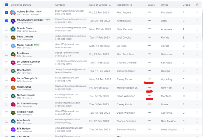
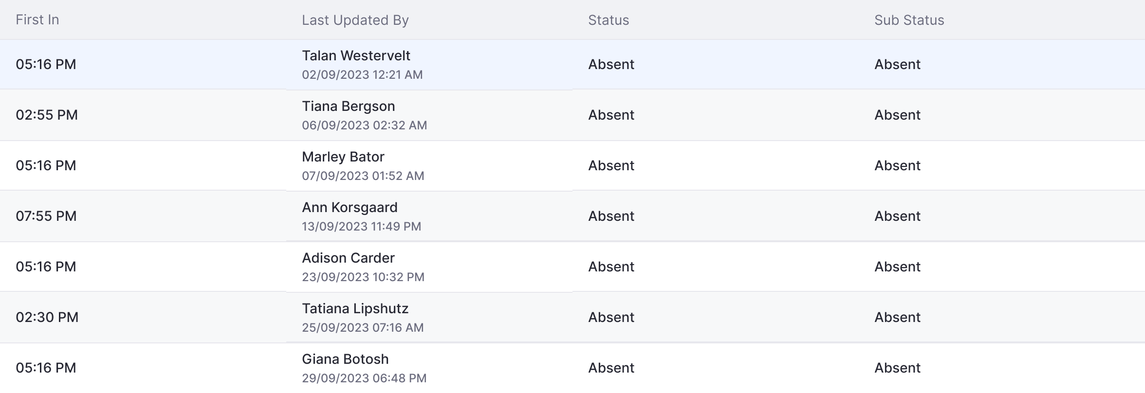
Web
Last Updated By
Consistent pattern across all tables: User name on line 1, Date (per user format setting) + Time hh:mm AM/PM on line 2.
Pattern 04 -- Chips and Status Colours
Web + Mobile
Actionable Chips (4px radius)
Used where users take action -- content icon left, action icon right. Horizontally scrollable sets. Never use a single chip alone.
Web + Mobile
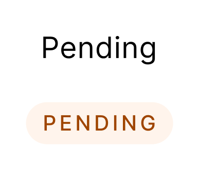
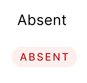
Informative Status Chips (16px radius)
View-only pills. Attendance statuses: Error D1 = Absent/Late, Success = Present, Navy = WFH. Process statuses: Warning = Pending, Teal = Approved, Error = Rejected.

Attendance status colour system
Module-specific (attendance) statuses use a dedicated colour palette. Process-level statuses (Pending, Approved, Rejected, Draft) follow a separate system. When both are shown on the same page, process status takes visual priority. White border added when status badge colour is too close to the page background.
Pattern 05 -- Filter (3 Methods)
Web
Pre-defined Tag Filter
Method 2: Upfront filter tags -- as dropdown (multiple options per category) or as chips (single category). Filtered state shows count badge. Combined with filter icon as a molecule.
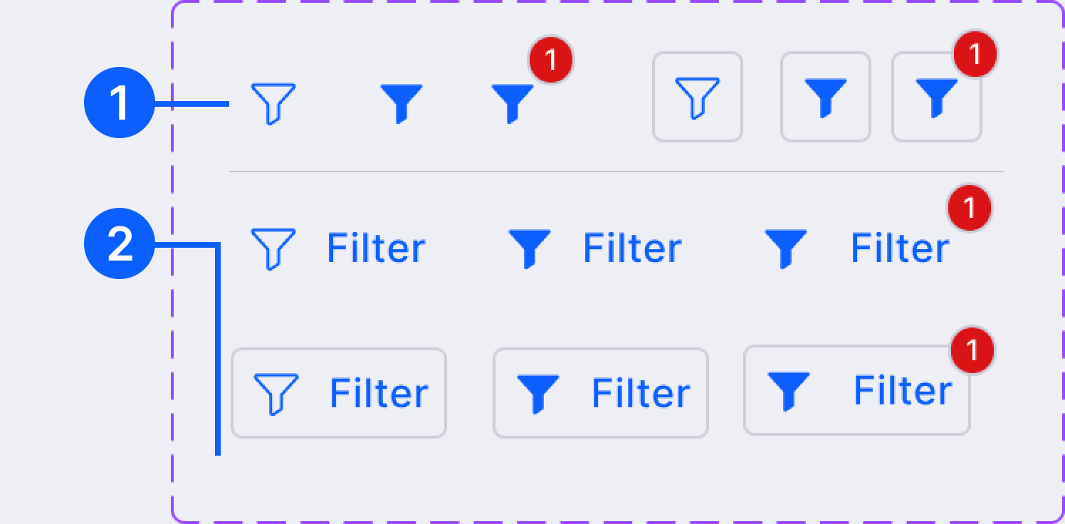
Web
Card Click Filter
Method 3: Clicking a count on a summary card filters the list below. Hover state indicates clickability. Click again to clear. Most intuitive for dashboard-driven workflows.
Pattern 06 -- Modal
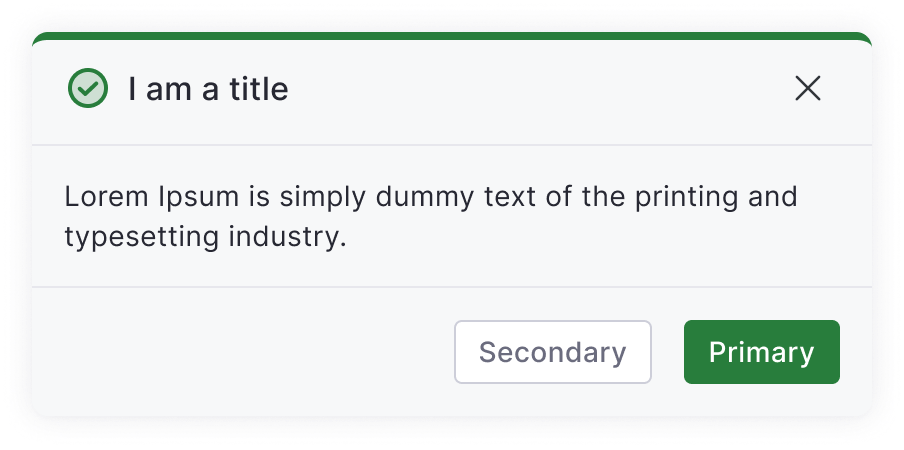
Web
Modal anatomy
Icon (type indicator) + Header (summary) + Body (explanation) + Action buttons + Close button. 4 variants: Information, Success, Warning, Error.
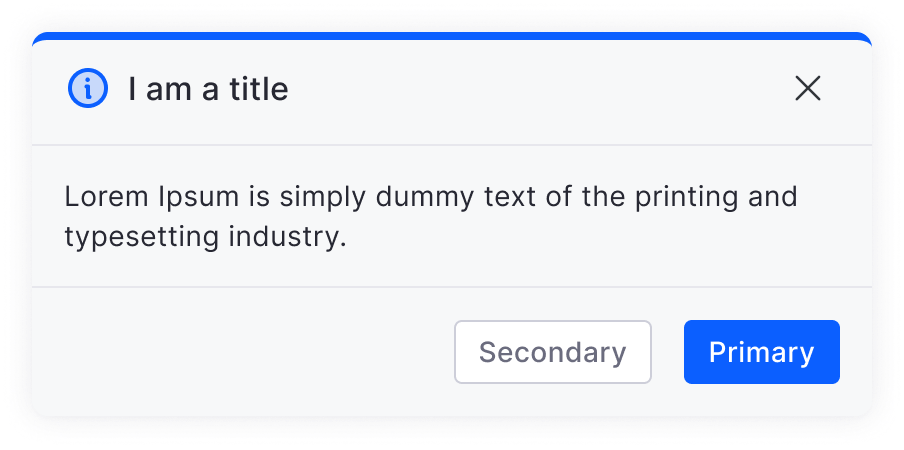
Web
4 Modal variants
Information = non-destructive confirmations. Warning = many irreversible changes. Error = destructive action. Clicking outside closes information modals only.
Pattern 07 -- Slider / Slideover
Web
Slideover sizes and anatomy
3 sizes: 600px, 900px, 1210px wide. Structure: Title + Status badge + Edit button (top right) + Employee info (if applicable) + Content (form rules) + Timeline (bottom) + Action buttons (footer).
- Status badge next to title always
- Closes on click outside
- Cancel/Close button rules based on whether primary button exists
Web
Back button inside sliders
Sub-pages inside sliders use a tertiary "back" button with left arrow. Save/discard prompt shown before navigating away from unsaved changes.
Pattern 08 -- Empty States
Web + Mobile
Empty state anatomy
Illustration + Content Header + Optional explanation + Primary action CTA. Table column headers are preserved in empty state so users know what to expect when data arrives.
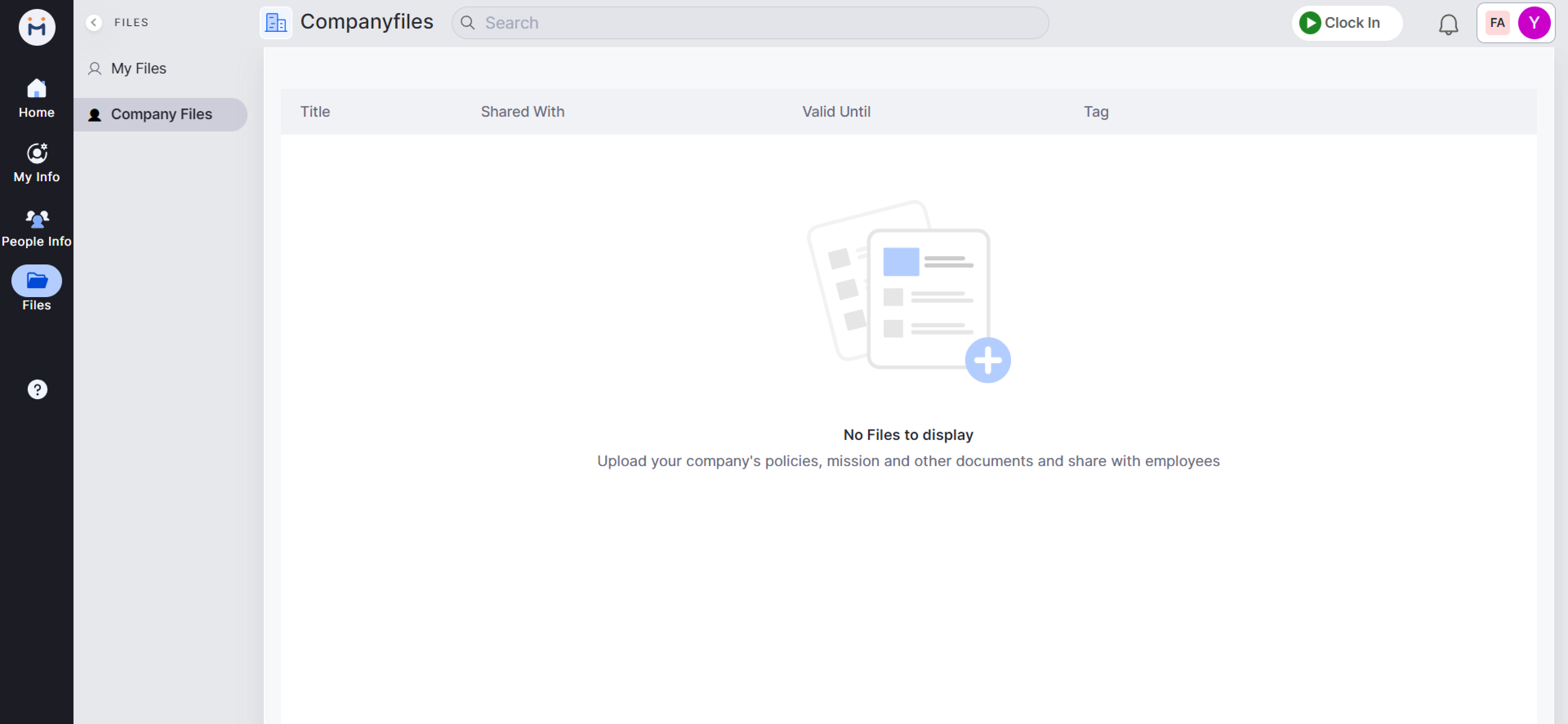
Web + Mobile
Permission-aware variants
Action buttons in empty state are conditional on user role. Users without edit permission see no CTA. Cards with zero count show "0" not an empty state. Illustration-only for no-action cards.
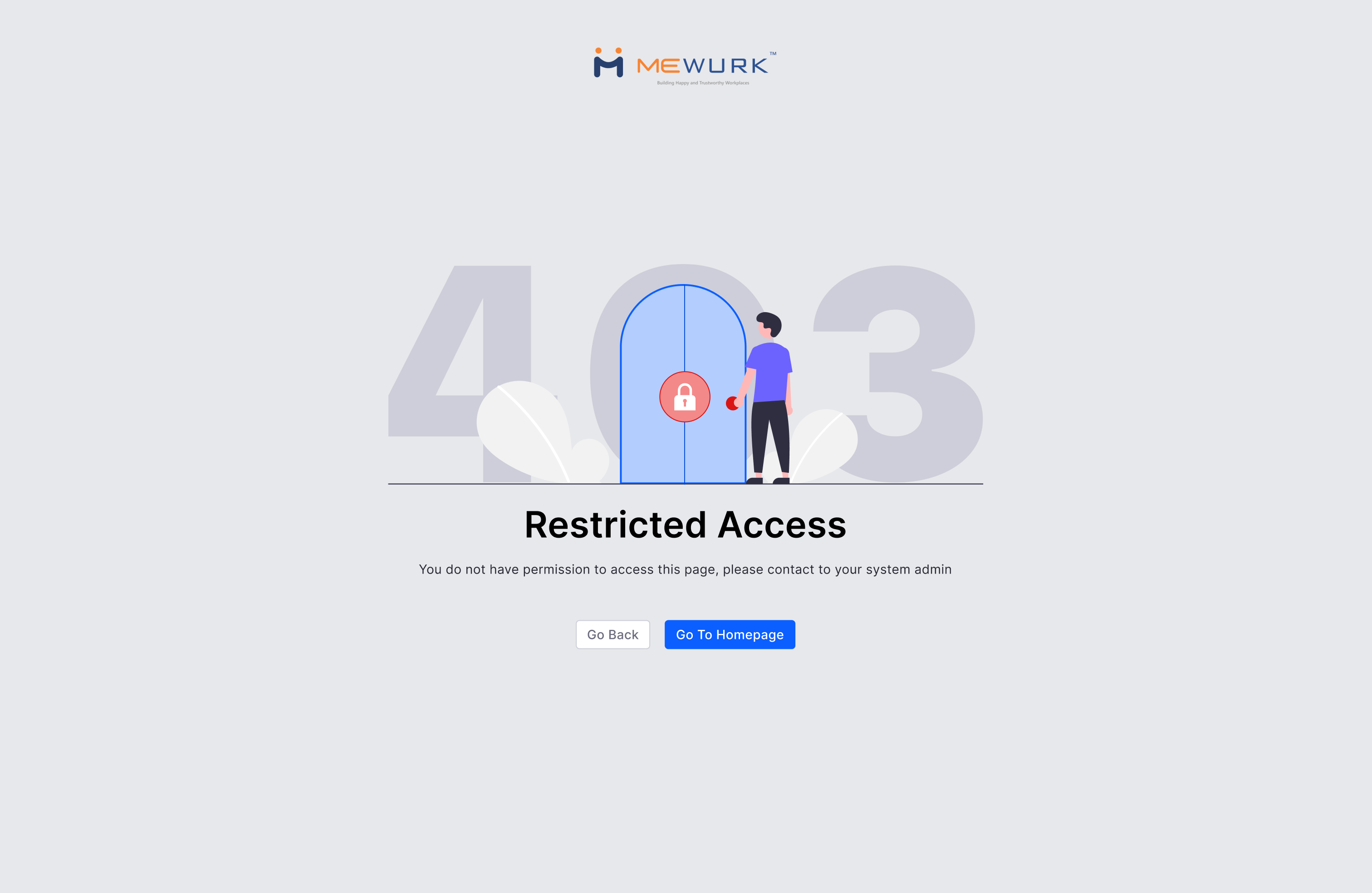
Pattern 09 -- Error States
Web + Mobile
404 and 500 error pages
4 parts: Undraw illustration + Simple headline (for the user, not the developer) + Subtext (why it happened) + Restore/Recover CTA (Primary + Secondary).
Web + Mobile
Inline field errors
Table cell error: red cell colour only + error message below text. No full-page error for cell-level validation. Error chip for count-based error states.
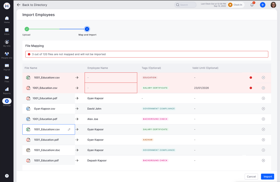
Pattern 10 -- Bulk Upload
Web
Bulk upload flow
Always opens in a new tab. Step 1: Download sample file. Step 2: Drag/drop or browse (xlsx, csv, zip, max 5MB). Step 3: Validate -- show error/success count inline. Step 4: Confirm upload.
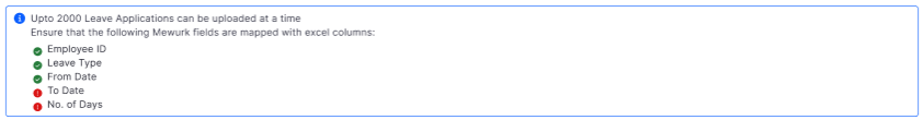
Web
Validation and error handling
Error alert shows how many records failed. Problem rows highlighted. Sample file download always below the upload box. Requirements shown below input at all times.
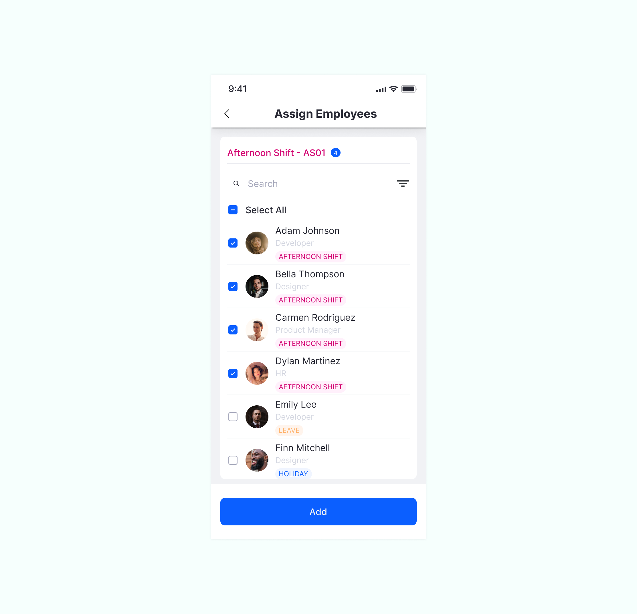
Pattern 11 -- Employee Card and Selection

Web
Employee Card (on hover)
Shown in space-constrained contexts. Contains: Name (with profile redirect) + Employee ID + Designation + Department + Location + Email (copy) + Mobile (copy) + Manager name.
Web
Employee Selection Dropdown
Same pattern used across Leave, Attendance, Payroll, Field for all employee assignment. "CONTAINS" search logic. Multi-select expands to 3-row height with scroll. Chips show selected count.
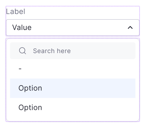
Pattern 12 -- Dropdown
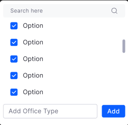
Web + Mobile
Dropdown types
Single/multi-select, with/without search, with sticky bottom actions, with description text, with status information. Blank state uses "--" not placeholder text.
Web + Mobile
Dropdown with description
When list items need more context, description text is shown below the option label in overline text style. Minimum lines of description text rule applied.
Pattern 13 -- Stepper

Web + Mobile
Stepper states
Active (filled circle + label), Completed (checkmark), Upcoming (outline circle). With count or with icon variants. Horizontal (web) and vertical (mobile) layouts.
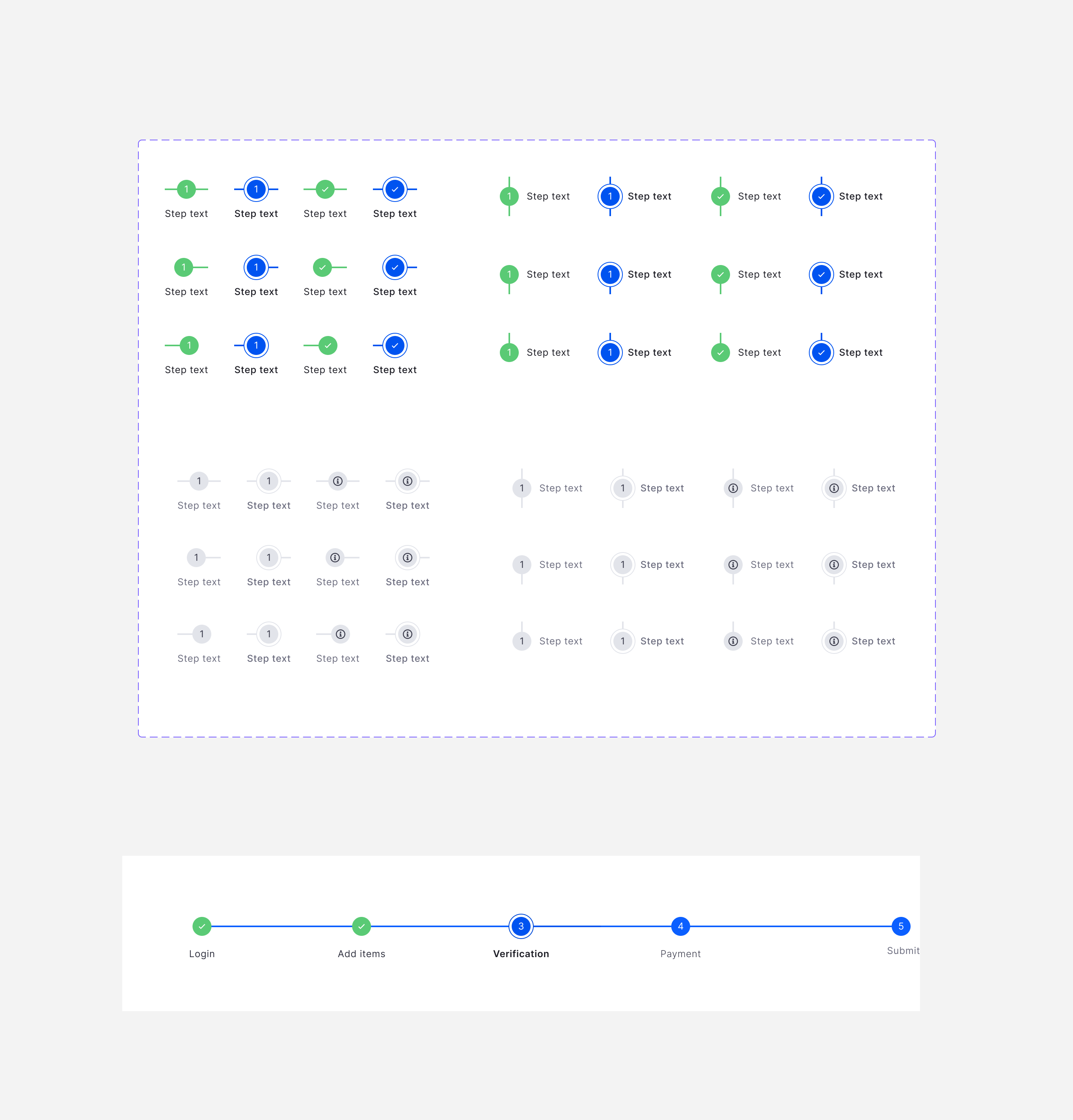
Web + Mobile
Editable vs non-editable steps
Editable: users can return to any step. Non-editable: linear progress only. Save/discard prompt before leaving a step. Previous button bottom-left in stepper footer.
Pattern 14 -- Loading States

3 loading patterns with timing rules
Skeleton loading (preferred -- maintains layout during load with shimmer animation), Circular progress (definite -- when progress is trackable), Linear progress (indefinite -- when wait time is unknown). Timing: Web 150-200ms, Mobile 200-300ms, Tablet 400-450ms. Under 0.1s: no loader needed. 0.1-1s: minor visual indicator. Over 1s: full feedback required.
Pattern 15 -- Date Format
Web + Mobile
3 configurable date formats
Type 1: DD/MM/YY (17/02/23). Type 2: MM/DD/YY (02/17/23). Type 3: YY/MM/DD (23/02/17). Set once in General Settings -- applied consistently across all tables, forms, cards, sliders.
Web + Mobile
Date format components
4 Figma components for each format variant: Primary/Default, With Time, Range, and Relative (e.g. "2 days ago"). All dynamically update based on user's format preference.
Pattern 16 -- Email Templates
Web + Mobile
Email template anatomy
Header: Tenant logo. Body: Card structure with headline + detail. Footer: Mewurk logo + homepage CTA + support email. Responsive for web and mobile.
Web + Mobile
2 card variants
Variant 1: Full white background (no icons). Variant 2: Light grey top half (with icon) + white bottom. Covers: leave approval/rejection, payroll processing, attendance alerts, reminders, policy updates.
Pattern 17 -- Back Button
Web + Mobile
Back button placement rules
4th level navigation: "Back to [section]" with left arrow, top-left of top bar. Inside sliders: "Cancel" secondary button if primary exists. If no primary: "Close" button only.
Web + Mobile
Back in stepper flows
"Previous" tertiary button bottom-left. Appears after first step only. Save/discard prompt shown before navigating away from unsaved step data.
Pattern 18 -- Mobile Patterns (Segment Control and Filter)

Mobile
Segment Control
Max 3 segments. 16px margin all sides. Active: Primary blue (#0B5FFF) with white text. Default: White background, dark text. Border-radius 4px for both states.
Mobile
Mobile Filter -- Bottom Sheet
Filter icon near search provides affordance. Tapping opens bottom sheet with filter categories. Selected options shown with badge count per category. Apply/Clear at bottom.
Pattern 19 -- Mobile Layout Pattern
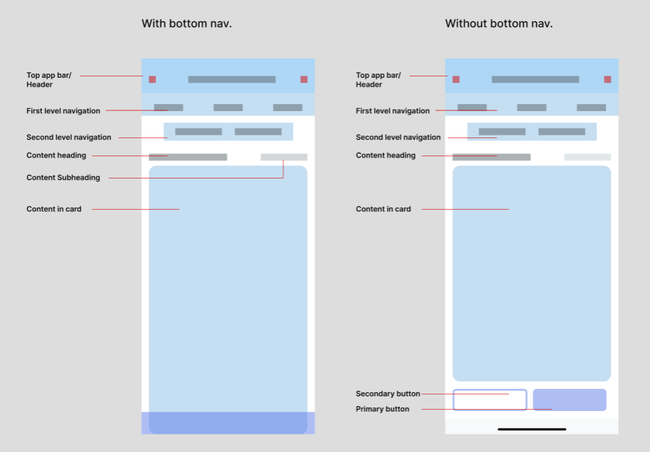
Consistent mobile layout hierarchy
Background: #F1F2F5. Top App Bar: White background, avatar/back icon left, page title center, action icons right. First-level navigation: Max 3 tabs. Second level: Search bar or Segment Control. Third level: Content title (20px Inter) with count in brackets and CTA right. This template is applied to every module ensuring users always know where they are.
Pattern 20 -- Dashboard Cards
Web + Mobile
Summary cards with counts
Cards show summary metrics with clickable counts that filter the list below (Method 3 filter). Hover state shows filter affordance. Clicked state shows active filter with clear option.
Web + Mobile
Card zero and empty states
Zero data: show "0" as the count, not an illustration. No records: Illustration (card-type icon) + "No Records Found" text. No action button on these states.
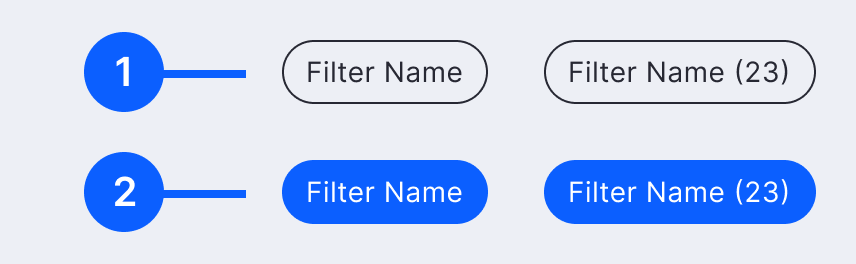
Pattern 21 -- Buttons

Web
4 button types
Primary (strong CTA, one per action), Secondary (alternative action), Text/Tertiary (miscellaneous actions), Icon Button. Each with Default, Hover, Disabled, and Loading states.
- Never use two primary buttons side by side
- Primary goes right, secondary goes left when paired
- Destructive actions use a danger variant

Mobile
Mobile button rules
One primary button per screen. Primary always right/above secondary. 3 sizes: Small (all pages at bottom), Medium (login pages), Large (full-width actions). Tertiary used for content title and filter clear.
Pattern 22 -- Forms

Web
Form field selection rules
Numeric fields: up to 7 values use Dropdown, else Numeric Input. Text fields: up to 7 values use Simple Dropdown, else Search + Select. Radio groups: pre-select default unless the choice is critical enough that the user should think it through.

Web
Validation strategy
Field-level validation preferred — show errors inline immediately. Form-level validation only when server-side validation is unavoidable. Never wait until submit to surface errors that can be caught earlier.
Pattern 23 -- Date Picker and Time Picker

Web
Date picker features
Date format respects user's General Settings preference (DD/MM/YY, MM/DD/YY, YY/MM/DD). Date range selection with easy month/year navigation. Disabled dates for past/future based on business rules per module.

Web + Mobile
Range selection
Start and end date highlight with range fill. Used across Leave application, Attendance reports, Payroll cycle selection. Mobile uses native OS date picker (react-native-date-picker) for platform familiarity.
Pattern 24 -- Checkbox

Web + Mobile
When to use checkboxes
For multiple independent choices — not mutually exclusive options (use radio for those). Used in forms, modals, side panels, and AG Grid for batch editing. Each checkbox works independently.
Web
Bulk select in tables
Checkboxes in AG Grid tables enable bulk actions. Select all via header checkbox. Bulk approve/reject button appears at top when rows selected. Used consistently across all HRMS modules.
Pattern 25 -- Left Navigation Detail and Breadcrumbs

Web
Left nav with sub-menu
3 or fewer levels: primary + secondary stacked left, tertiary as horizontal tabs above content. More than 3 levels: tertiary goes inside secondary nav. Secondary menu collapses to reveal more real estate, with hover preview remaining visible.

Web
Breadcrumb rules
L1/L2 are on sidebar — no breadcrumb needed. L3 simple page: page header suffices. L3/L4 internal page: "Back to parent" breadcrumb or "Back to parent + current page with dropdown". L5/L6: full breadcrumb trail shown.
Pattern 26 -- List View and Count in Table

Web
List view with AG Grid
Standard structure: External Filters → Summary Cards → AG Grid Table. Empty state, skeleton loader, column-level filters, row-level actions, multi-row bulk actions all follow shared guidelines.

Web
Count badge in table
Entity count shown as badge in column header or above the table. Badge position: after label, never before. Used for showing sub-item counts, pending request counts, and assignment totals inline in rows.
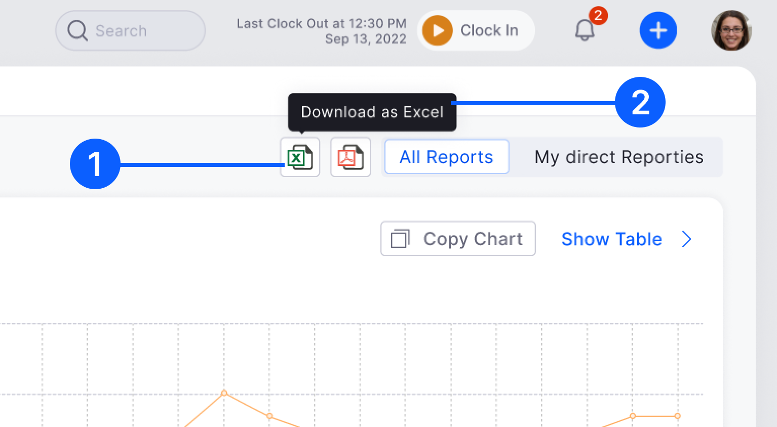
Pattern 27 -- Download and Export

Web + Mobile
Export flow
Export option present on all data-heavy pages. Format picker: CSV, Excel, PDF. Used in Reports, Payroll, Attendance Summary. Download triggers immediately or shows options inline — never redirects away from the current page.

Web + Mobile
Report automation
Advanced option: schedule and automate report sharing — define date, time, recipient, and delivery method (app notification or email). Used in Reports module for monthly HR owner reporting.
Pattern 28 -- Avatar and Company Logo

Web + Mobile
Avatar system
Default: Single alphabet on one of 22 background colours. User profile: circular photo. Company logo: square shape, 2-alphabet default. Consistent across all modules — same component, same fallback logic everywhere.

Web + Mobile
Avatar sizes and usage
Multiple sizes for different contexts: large (profile pages), medium (list rows, cards), small (table cells, chips). Hover triggers Employee Card molecule with full contact details.
Pattern 29 -- Mobile Cards and Tabs

Mobile
Mobile card rules
Border-radius 8px, 1px border #E7E7ED, white background, no shadow. 16px internal margin all sides. Selectable cards: Default vs Selected (primary blue border + light blue fill). Maximum 3 segments on screen.

Mobile
Mobile tabs
Active: 16px Inter, dark text, 2px underline indicator. Default: 16px Inter, muted secondary text. Maximum 3 tabs per screen. Used as first-level navigation within modules (e.g. Pending / Approved / Rejected).
Key finding -- Policy Creation as a reusable pattern
One of the most valuable outputs of the design system audit was discovering that policy creation follows an identical structural pattern across 6 modules -- Attendance, Leave, Payroll, Field Visit, Shifts, and Expense. Once identified, we standardised it as a reusable template:
Step 1
Create Policy
Add title, define rules. Draft saves automatically. Module-specific settings handled here.
Step 2
Configure Rules
Progressive disclosure. Complex rules shown per section, not all on one screen. Reduce cognitive load.
Step 3
Applicable For
Separate step. Select employee criteria (max 3 combinations). Overlap validation built in.
Step 4
Assign
Create and assign can be done in separate sessions. System enforces one policy per employee with re-assign alerts.
Reusable pattern impact: Before standardisation, each module had its own policy creation UI -- different step counts, different assignment UX, different validation behaviour. After standardisation, HR managers who had used Leave policy creation could immediately use Attendance or Payroll policy creation without any re-learning.
Step 4 -- Figma Library and Documentation
One Figma library. One token system. Two platforms.
The component library was built in Figma with full variant support, nested component overrides, and a shared token layer that spans both web and mobile. Every pattern documented in Confluence with the same structure: Importance, Goals/Needs, Solution, Anatomy, Variants, Do's and Don'ts, and Usage Examples.
- Figma component library: All atoms, molecules, and organisms with Figma variants and auto-layout. Any designer on the team can swap states and override content without breaking the structure.
- Shared token layer: Colour tokens (Light L1, Secondary Text L0, Error D1, etc.), spacing tokens, and typography tokens are defined once and applied across web and mobile components.
- Confluence documentation: Every pattern has a dedicated Confluence page with screenshots, anatomy diagrams, and explicit do/don't guidance. 30+ patterns documented to date.
- Design-to-dev handoff: Component names in Figma match class names in the codebase. CSS variables align with token names. AG Grid table columns documented with exact pixel values for developer implementation.